why-every-yc-company-uses-the-same-4-typefaces-breakdownmd
7,774 chars · 1,944 tokensUTF-8 · LF
# why every YC company uses the same 4 typefaces... (breakdown)
---

go to any yc batch page and click through 20 startup websites.
16 of them will be using one of four fonts:
- inter
- geist
### - söhne
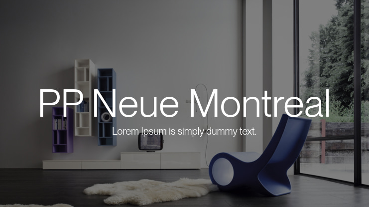
### - pp neue montreal
this is a convergence of access, optimization, and herd behavior that created the most homogeneous era of startup typography in the HISTORY of tech
this is what each font signals, why they all got adopted, and why using something different is actually a competitive advantage right now...
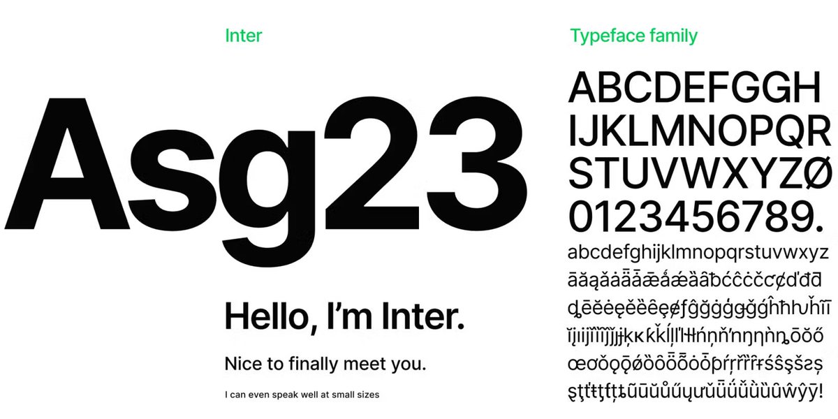
inter: the default:
inter was designed by rasmus andersson specifically for computer screens.
open source, free, available on google font, ships as a system font on most modern devices, and loads instantly because it's often already cached in the browser
inter became the startup DEFAULT because it's genuinely good at everything and costs nothing.
its clean at small sizes, readable in dense data tables, professional enough for enterprise, friendly enough for consumer
### basically the typographic equivalent of a white t-shirt lol
it signals: "we're a technology company and we didn't overthink the font choice."
and communicates competence and professionalism without any specific personality.
inter is the absence of a typographic opinion
who uses it: roughly 40% of startup websites.
it is the single most popular font in saas so if you use inter, you look like a startup.
which is fine if looking like every other startup is acceptable to you
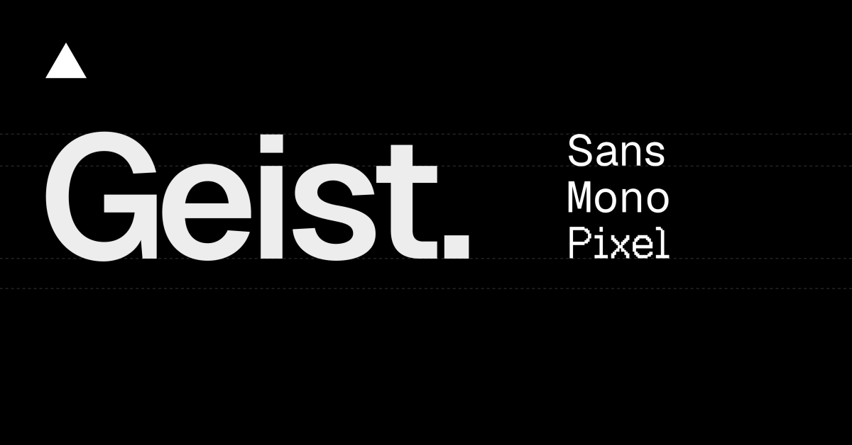
geist: the vercel aesthetic:
geist was created by vercel and released in late 2023.
feels like inter's slightly more refined cousin (rounder curves, friendlier letter shapes, a touch more modern)
free for commercial use and installable via npm which means it integrates seamlessly into react and next.js projects
geist became popular because it shipped with vercel's ecosystem.
every next.js template, every vercel deployment guide, every shadcn/ui component defaults to geist.
the vercel stack is the MOST popular frontend stack in startups right now so geist inherited that distribution automatically
### what it signals: "we use the modern stack"
geist communicates technical sophistication and alignment with the vercel/next.js ecosystem.
it kind of says "our engineering team knows what they're doing" in a way that inter doesn't because geist is associated specifically with cutting- dge frontend development
who uses it: roughly 15-20% of startup websites and growing fast. especially prevalent in developer tools, ai products, and anything built on next.js
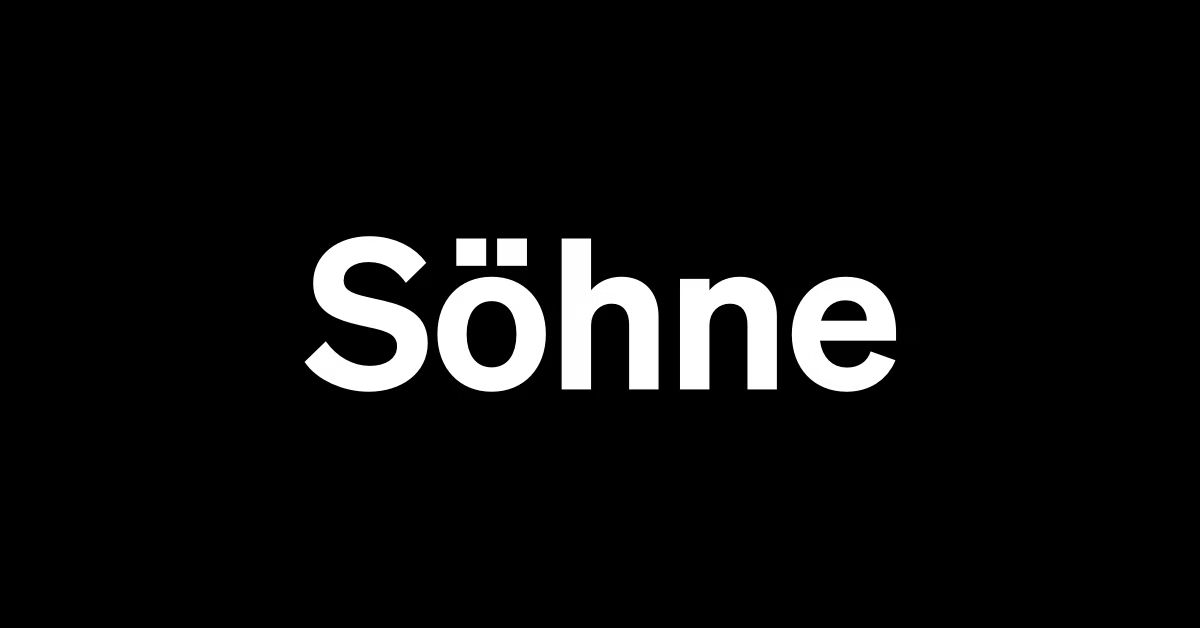
söhne: the premium signal:
söhne is designed by kris sowersby at klim type foundry in new zealand.
it captures the memory of akzidenz grotesk filtered through helvetica's influence
specifically, it ENVOKES the analogue feel of standard medium used in new york city subway signage
but it's not anywhere close to free (licensing starts at like several hundred dollars but not sure of the exact price)
söhne became the premium startup font because stripe and openai use it.
when the two most PRESTIGOUS tech companies in the world both choose the same typeface, every startup that wants to be perceived as premium follows
### what it signals: "we're serious and we have taste"
söhne communicates authority, established credibility, and design sophistication.
the fact that it costs money to license also signals that the company actually cared enough about typography to invest in it rather than defaulting to a free option.
built from the semibold weight outward, it has a confident boldness that reads as institutional quality
who uses it: roughly 10-15% of startup websites. is heavily concentrated in fintech, ai research, and companies that position themselves as infrastructure or institutional grade
pp neue montreal: the creative edge:
pp neue montreal is designed by pangram pangram foundry.
it's a geometric grotesk with slightly wider proportions and distinctive character shapes
feels contemporary, slightly editorial, and less "tech company" than the other three
pp neue montreal became popular through the design community by constantly showing up on awwwards and lapa ninja (87+ featured landing pages using it).
designers choose it because it has more personality than inter or geist while STILL being clean enough for ui
### what it signals: "we care about design and we're not another generic saas"
pp neue montreal communicates creative confidence, design forward thinking, and a brand that prioritizes aesthetics.
it is the font choice for startups that want to feel premium and distinctive without going full editorial serif
who uses it: roughly 10-15% of startup websites. common in design tools, creative platforms, consumer apps, and any startup where the brand is part of the product appeal
why they all converged:
three forces created the "startup font" phenomenon:
figma template culture. most startup websites begin as figma templates. the most popular templates use inter, geist, or pp neue montreal. the font comes pre loaded. changing it requires effort and a typographic opinion and most founders don't have either, so the template font ships to production
framework defaults. next.js defaults to geist. tailwind ui examples use inter. shadcn/ui components ship with inter or geist. when the developer framework chooses the font, most teams NEVER override it
herd behavior. "stripe uses söhne and they're worth $90B. we should use söhne." the logic is understandable but backwards because stripe's success has nothing to do with their font choice. but the association creates an illusion that using the same font transfers some of stripe's credibility
### the result: the most homogeneous typographic landscape in startup history
you open 20 startup websites in a row and you CANNOT distinguish them by typography alone.
every page has the same geometric sans serif, the same weight distribution, the same letter spacing. the font is invisible because it's identical everywhere
why using a different font is a competitive advantage:
### when every startup uses the same four fonts, typography becomes invisible
the visitor's brain processes the text without registering the typographic choice because it looks like EVERY other page they've seen today
### but a distinctive font creates a pattern interrup
a startup using a well chosen serif (like editorial new or reckless neue) immediately stands out because the shape language is different from everything around it.
the visitor's eye pauses and the page feels differen
### that difference creates MEMORABILITY
creative bloq's 2026 typography trends report notes a growing shift away from what they call "tech driven blanding"
type foundries are reinterpreting classic designs, and audiences are responding because "it cuts through the uniformity of the last 10+ years"
### BUT, don't use a different font just to be different
use a different font because it communicates something specific about your brand that inter/geist/söhne/pp neue montreal can't.
if your product is warm and personal, a rounded sans-serif creates a different feeling
and if your product is editorial and authoritative, a modern serif says something that no geometric grotesk can
### clear
also, drop me a follow because i drop a LOT of valuable breakdowns and pure sauce just like this
ref · Sfe2M3scxmdbot.com/c/Sfe2M3sc